What makes a good eCommerce checkout?

The COVID pandemic has rapidly accelerated online usage and eCommerce growth. We spend more time online, shop more frequently and shop for more types of products. Here are a few of the key behaviours impacting checkout demands. We’re:
- More dependent on mobile devices, specifically smartphones
- Shopping more frequently and across more product categories
- More enthusiastic about omnichannel ordering, specifically collect in store
The challenge is due to increase in 2021 and beyond due to the new payment regulations and enforcement of SCA (Secure Customer Authentication) for online transactions. According to payment consultancy CMSPI, €85 billion in sales revenue will be lost due to transactions subject to SCA that retailers aren’t prepared to handle. SCA can increase the layers of validation before an order can be processed, so your checkout UX is more important than ever!
Retailers with well-designed, intuitive checkout processes are likely to perform better than lesser prepared competitors. In this article, we explore what good looks like for key eCommerce checkout features.
Getting the Fundamentals Right
Let’s start with some context. Loqate’s recent report - The future of the digital checkout - found the following reasons for abandoning an online checkout (people who enter the checkout but don’t complete the purchase).
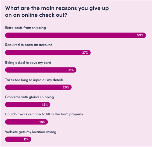
With this in mind, let’s define some key capabilities and look at retailer examples of good implementation.
1. Mobile optimised
It’s safe to say we’re in the mobile-first era, which is why Google has switched to a mobile-first index. For some retailers, mobile is more than 70% of all sessions.
During last year's busy holiday shopping season, a third of all online purchases came from mobile phones. On Black Friday, nearly 40% of sales came from a mobile device. Of course, these numbers were boosted due to the global pandemic but the trend towards mobile has been evident for several years.
With more shopping taking place on smaller screens, your checkout has to be mobile optimised, and for many eCommerce teams, this means designing the flow mobile-first. For example, checkout pages need to:
- Make use of common gestures like swiping
- Ensure form fields/labels are large enough and have adequate spacing
- Ensure CTAs are easily clickable with adequate hit areas
- Use buttons/tiles for input selection
- Persistent order summary
- Display the correct keypad based on the input field
- Load fast and work quickly by leveraging modern technology
- Use geolocation for location-specific elements (e.g. BOPIS store selection)
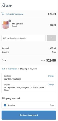
Screenshot: Recess mobile checkout with large, clear CTA buttons at the bottom of the screen where they can be easily pressed and a simple ‘Show/Hide order summary’ section to avoid pushing form fields down the page unnecessarily.
Top tip
Do full end-to-end checkout tests on the most popular mobile devices to access your eCommerce store (based on the percentage of visits). Test core use cases and note down any bugs, errors and UX issues.
2. Streamlined checkout
The principle is to minimise the cognitive effort to complete your checkout. This means simplifying the steps, minimising data entry and only capturing the data you need to legally and effectively process your customer’s order. Some brands use a 1-page checkout; others use multi-step but with a clear progress bar and enclosed navigation (removing all unnecessary page elements to focus people on the checkout tasks).
Amazon is the gold standard here; they were the first large retailer to crack one-click checkout (they even had the patent for the ‘1-Click’ technique until it expired in 2017). By remembering stored account and payment details, Amazon enables account holders to skip straight to the payment confirmation page, or to quick buy from the product page.

Screenshot: Amazon providing the ‘Buy now’ fast checkout from the PDP (Product Details Page), letting registered customers purchase without having to go through the standard checkout flow.
Top tip
Ensure your checkout is flexible and customers can edit pre-selected options, such as delivery address and payment method. You don’t want to create unnecessary friction by making people update their information or change default settings.
3. Guest checkout
Having to create an account is the second most common reason for checkout abandonment, and Forrester found that more than 48% of online retailers said a guest checkout was the most important factor in increasing shopping cart conversion rates on their websites.
Registration is unnecessary for most eCommerce sites (there are exceptions, e.g. membership organisations like The Wine Society). You don’t need someone to create an account to process their order; secure the payment, then worry about increasing your registration rate.
The ultimate checkout goal is to be friction-free. Registration is time-consuming and demands a commitment that some shoppers aren’t willing to make. By offering guest checkout, you reduce friction and let shoppers checkout as quickly as possible.
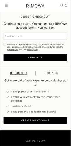
Screenshot: prominent guest checkout on Rimowa, clearly stating customers can create an account later in the process if they want to.
Top tip
Convert guest users to registered customers on the order confirmation page with a clear explanation of the benefits of simply adding a password (e.g. online order tracking, member rewards)..
4. Best in class form optimisation
Forms can make or break checkouts. You should only include form fields that are essential for the processing of the order - if it’s optional, why show it? If someone in the business demands additional data capture, A/B test any new fields to check that it doesn’t slow down the user and negatively impact conversion.
Below are golden rules for form design:
- Minimise form fields and reduce the need for typing
- Enable auto-fill to speed up form completion
- Remember previously entered data to avoid double entry
- Spread long forms across separate pages
- Use buttons/tiles for input selections on mobile
- Clearly distinguish required from optional fields
- Provide clear instructions for input requirements (e.g. passwords)
- Provide inline validation and show when a field has been successfully completed
- Provide customer-friendly error messages
- Set the correct keypad for each field type
- Disable invalid inputs (e.g. letters can’t be added to phone numbers)
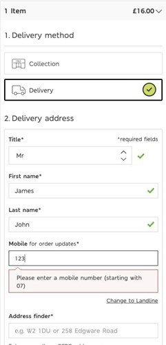
Screenshot: M&S provides visual validation of completed fields with a simple green tick and display a user-friendly message inline next to fields with errors.
Top tip
Ensure your customers can edit previously entered data at any stage before they confirm the order. For example, allow customers to edit the delivery address and method in the order summary (as Recess does in the example above).
5. Payment flexibility
A lack of relevant payment options is one of the reasons people abandon eCommerce checkouts. Customers typically use one or two preferred payment methods, and these vary from country to country (e.g. AliPay is popular in China and Ideal is popular in the Netherlands). The best checkout experience isn’t about offering as many payment methods as you can fit on the page; it’s about offering the most relevant payment types based on your customer group.
Customers expect choice and convenience; whilst credit and debit cards remain the number one payment method, the following payment options have increased in demand:
- BNPL (Buy Now Pay Later) e.g. Klarna, Clearpay
- BOPIS (Buy Online Pay In-Store)
- Pay by Invoice (for B2B)
- E-wallets e.g. Apple Pay, Samsung Pay

Screenshot: ASOS offering Klarna for BNPL and clearly showing the monthly instalments on the PDP to set clear expectations before the checkout.
Top tip
Evaluate the full global payment capabilities of your payment partners to see which relevant payment options you can enable on your website. Ask your customers which alternative payment methods they regularly use on other websites.
6. Improving acceptance rates
PSD2 and SCA tighten security for online payments, but it also raises the bar for payment acceptance. The percentage of declines for online payment is nearly four times higher than for card-present transactions (15% and 4%). While some declines are expected (e.g. due to insufficient funds), many transactions are declined due to over-stringent fraud rules or inaccurate processes.
Your challenge is to balance protecting your eCommerce business against fraud and approving as many legitimate orders as possible.
- Do you know your order acceptance rate?
- Has it gone up or down in the past few years?
- How does it compare country to country by payment method?
If you see a spike in declined orders, consider speaking to specialist platforms like Signifyd to test how they can help you improve the acceptance rate and protect your revenue stream.
Top tip
Ensure your payment provider has adequate AI/ML tools to identify legitimate cards to improve acceptance rates, for example, effectively updating details for expired cards that have been saved using secure tokens.
7. Global data validation accuracy
Most eCommerce sites have international shoppers even if they don’t have local language site versions. International shipping opens up new markets and revenue streams, but it also presents challenges for your checkout.
Delivery and billing address entry is a good example. Address structures vary around from country to country in terms of the data schema, the number of fields required and the label associated with each field. In the UK, we use postcodes, whereas countries like the US use ZIP codes. Your checkout needs to handle the data validation and localisation of forms and language to align with how local markets expect to input data.
We can link this back to our discussion on payment flexibility. Depending on the payment method selected by your customer, you may have different validation rules, payment gateways or checkout flows. For example, some eCommerce sites enable payment by Direct Debit, which requires the input of bank details.
Without validation, error rates can be high, resulting in issues completing the direct debit mandate. A smoother solution is to set up e-mandates and use bank verification to ensure bank account details are correct to avoid payment errors and bank charges. Avoiding such errors is important for B2B commerce when onboarding new customers.
Your checklist:
- Do you tailor address forms based on the country selected?
- Do your validation rules align with local data structures (e.g. validating the phone number based on the country code)?
- Do you speed up address data entry by enabling real-time validation as the user types?
- Does your address validation tool work for all the countries you deliver to?
- Does your checkout support Unicode for international characters?
- Are you using appropriate tools to validate payment data?
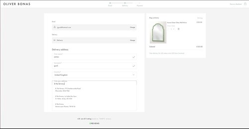
Screenshot: Oliver Bonas using real-time address lookup and verification, displaying relevant matches as the customer types.
Your key take-aways
Checkout design and user experience are critical to your eCommerce success. We recommend that checkout optimisation is a continuous process because customer behaviour and technology change, so you need to stay in tune with the latest good practice. Ensure you regularly audit your checkout process end-to-end and create a task list of improvements, then test changes and measure the impact. Good luck!
Download the Future of the Digital Checkout report now