6 mins
15 hacks to optimise UX on HubSpot forms
1. Minimise input fields
Forms are an exchange of information and something of value in your offer. How can you and the user get the most value as quickly and easily as possible? Simple, only ask for the information you need concerning the value of the offer. By minimising the number of questions, you decrease the cognitive load on users and boost up the completion time. Remember that every additional input field reduces the chances of conversions by 26% per field! Sometimes a form needs to be longer. No problem, this will result in fewer but higher-quality leads. In this case, it’s best to group related fields into sections, e.g. personal information, contact details. You can add a header text or rich text field into the HubSpot form to achieve this.
Tip: To keep forms short but still collect information, use progressive fields within your nurturing programme. This way, you can ask a different question with each form fill.
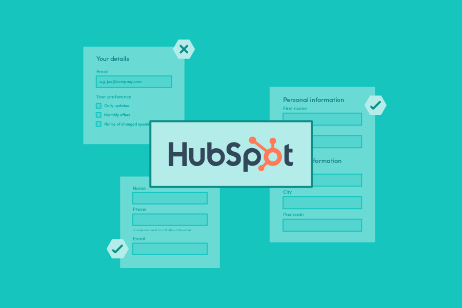
2. Labels
The label tells users what information belongs in the form field. The best position for placing a form label is above the input field. Do not use the placeholder text for this. The placeholder saves some space as it sits inside the form field rather than above. But there is a drawback. As soon as users start typing, the label disappears. To see the label again, they are required to remove the input. Also, some users prefer to press the tab key to go to the next field. They don’t even see the label when using the tab key.
3. One Column Layout
Use a single-column layout to keep the flow of the eyes in a unidirectional flow, from top to bottom. Research shows that this results in faster completion - on average, 15.4 seconds faster than a multi-column form. Multi-columns confuse users. They don’t know whether to finish one column before addressing the other or progress horizontally before dropping to the next line. With a single-line form, there is only one way to go. A/B test suggestion if your form is long: More than one field per line can work for inputs that are a coherent entity, like first and last name or postcode and city. In that case, you could experiment with a hybrid form, in which you use elements of both one and two columns.
4. Ask the easy questions first
If your form has some complex personal questions, consider asking them at the end. Once a user answers a couple of simple questions, they are more likely to complete the form. If you ask complex questions at the beginning, chances for abandonment are high.
5. Explain any input or formatting requirements
If an input field requires special formatting, don’t make users guess. Specify the instruction close to the input field. For example, if a password needs to include special characters, explain this through help text. The Placeholder Text gives the user a short hint. It provides instructions on how to fill out the field or gives an example of the required input. The Placeholder Text shows within the field but is not submitted if the field is not touched. Unfortunately, user testing shows that Placeholder Text is confusing for the user. As users type, the hint disappears, and if users forget it, they need to clear the text to see it again. It’s better to use the Help Text for instructions as it displays between the label and the form field as a makeshift sub-heading.
6. Copy prompts
Prompts that clearly tell a user what to do work better. Always use a concrete verb to name the desired behaviour. Enter your details instead of Your details or Tick your preference instead of Your preference. This increases the chance of conversion. Tick is more concrete than Indicate and thus easier to follow up.
7. Limit Typing with Autocomplete
Anything that prevents unnecessary typing will improve user satisfaction, decrease error rates, and boost form completion. Filling out an address is often the most cumbersome part of any online signup form. Users get irritated by the keystrokes required to enter their address, especially on mobile. Address autocomplete technology can reduce address entry time by up to 78%. It cuts back data entry errors at the point of capture by more than 20%, improving the end-user experience. Read all about the benefits of using address capture on your HubSpot forms in this blog.
8. Be careful with default values
Default values can minimise the user’s effort to fill the form. But make sure the default value is correct. The default value is submitted unless the user changes the value. Prepopulating contact fields with known values also limits the user’s input. Be careful with both. People scan forms, and they won’t spend extra time to confirm the inputted data. If an airline prepopulates your name, for example, Vicky. But the name in your passport says Victoria, that will cause a problem. Users scan the information and miss this mistake.
9. Minimise dropdown menus
If your dropdown menu has got less than six items, use radio buttons or checkboxes instead. Selecting an option from a dropdown list - especially on mobile - is a multi-step process. By making all options visible, you reduce the number of clicks. Stack the radio button or checkboxes vertically for easy scanning and faster processing.
10. Make your form Tab-Ready
Some users use the Tab key to move to the next input fields. Therefore, test your form with tab key navigation to ensure, it follows the correct sequence.
11. Asking for Sensitive Information
People are increasingly concerned about their privacy and security. They will be hesitant to provide any information that they consider private or don’t think you need. Make sure to explain why you need this information by providing a support text. With no explanation, they are likely to abandon the form. You can use the Help text for this on HubSpot forms.
12. Include social proof
Social proof is borrowing third-party influence to convince potential customers. You can add social proof as supporting copy on or near a form to encourage conversions. Social proof can range from “X customers served” to “high-profile client logos”. High-profile client logos are likely the best social proof as they balance high recall with low cognitive load, which means they are the most memorable.
13. Action button
The action button on the form triggers the form submission. Having the button label complete a sentence is a fantastic way to convince people to click through. Verb-first commands are best (e.g. “Order now”). The copy should be action and benefit-oriented and tell users what happens next. Here are some examples: Book Ticket, Create Account, Get Quote, Download Now, Start Viewing. Avoid generic labels such as “Submit” and “Send”. To avoid confusion, match the button with the title.
14. Form Feedback
Once a form is submitted, provide feedback to the user to let them know it has been successful. If you intend to get in touch, tell them how long it will take (e.g. “Thank you! We will get in touch within 48 business hours”).
15. Accessibility
Making a form accessible ensures it can be used by as many people as possible, including people with impaired vision. Globally, at least 2.2 billion people have a vision impairment. That’s a lot of potential orders, surveys, or registrations you might be missing out on! Although accessibility is not just about contrast and colour, these are vital. When you style your forms, make sure there is enough contrast between text colour, background colour, and button colour. There are loads of free contrast checkers online to help you.
There are plenty of ways to optimise your forms in HubSpot, and by testing these methods, you can start to build up an idea of what your customer base responds to the most. Although your forms will undoubtedly evolve over the years, by keeping these tips in mind, you'll know which key points to consider when putting new pages together.
Want to learn more about optimising forms for your customers? Look at how our address capture solution helped GymShark improve its online store.