The Standard in Global Address Verification
Powered by the most curated location data in the world.
Loqate is the most advanced software for capturing, verifying and enriching address data globally - delivering the unrivalled precision businesses need.
More than 3 billion address verifications each month by over 14,000 customers around the world
Global Coverage That Delivers Local Precision
We set the standard by combining the richest globally curated data with the most sophisticated parsing and matching technology in the world. The result is verified address data, standardised, enriched, and structured to the most precise local format.


Easily deployable and highly performant APIs
Loqate’s powerful address capture and verification APIs are architected to run on any application and scale to meet local or global needs. As a result, you'll be up and running in minutes.
const url = "https://api.addressy.com/Capture/Interactive/Retrieve/v1.20/json3.wss&Key=AA11-AA11-AA11-AA11&Id=GBR|52509479";
fetch(url, {
    method: 'POST',
    headers: {
        'Content-type': 'application/x-www-form-urlencoded'
    }
})
.then(response => response.json())
.then(data => {
    if (data.Items && data.Items.length > 0 && typeof(data.Items[0].Error) === "undefined") {
        // Your address results e.g. console.log(data.Items[0].Line1);
    }
})
.catch(error => console.error('Error fetching data:', error));
Unrivalled address data coverage and precision
We curate the most comprehensive and precise premise-level address data for every country and territory in the world by combining multiple data sources into a single best address reference record, used by our verification engine to capture, verify and enrich input data.
Superior address match rates & uplift precision

![]()
Most curated address data in the world
We curate the most comprehensive and precise premise-level address data in the world by combining multiple data sources into a consistent and reliable single view of a location.
![]()
The standard in global address verification
We pioneered data curation methods and AI technological innovations that power the superior capabilities behind our location data products and services.
![]()
Superior AI parsing and matching technology
The superior capability of our verification engine to identify location elements and remove noise in the input data significantly improves match rates and delivers a truly unrivalled global address capture, verification and enrichment solution.
![]()
APIs that can be deployed anywhere and at scale
Our global address verification engine delivers cloud-native, low-code, platform agnostic and horizontally scalable options perfect for both smaller and larger-scale deployments.
![]()
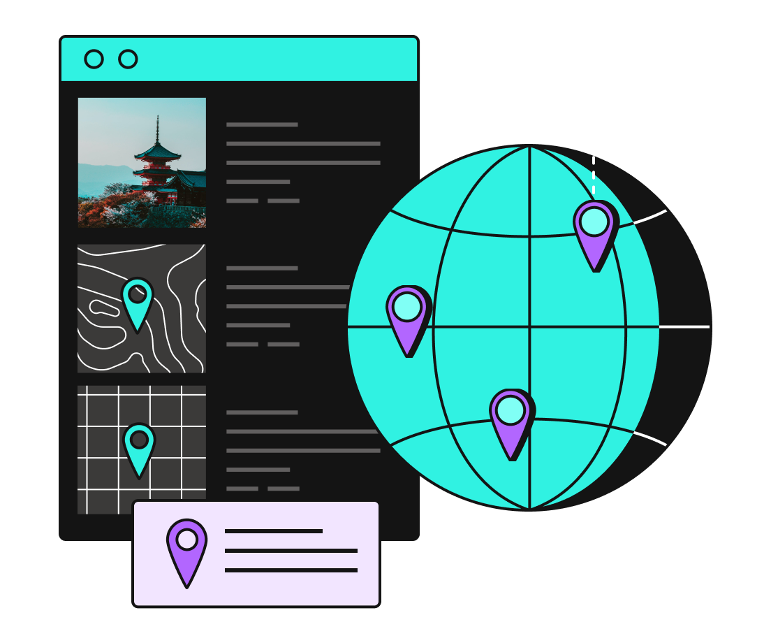
On our way to everywhere
We offer premise-level location data across 250 countries and territories in 6,500 languages – and are continually investing in new regions to bring accurate data to the world.
![]()
Loqate community of experts
Our team of experts are with you at every phase of your engagement with us. We are a community of location data experts across the world that can be relied on by our customers anywhere, anytime.
"We know that address validation has helped improve the customer journey, which has had a positive impact on conversion"
 Read more
"Loqate's type-ahead addressing technology is highly intuitive and predictive which makes it ideal for customers on the move using mobile phones"
 Read more
"Loqate gives our customers the confidence that our products will arrive on time and to the right location."
 Read more
"It's crucial to populate web forms with accurate delivery address details to ensure we meet customer expectations and deliver on our promise of 100% happiness guaranteed."
 Read more
"The address search technology from Loqate is a vital component in the success of giffgaff's online customer journey."
 Read more